In the beginning was the Word: The Lettering of Des Hynes
Writer Stephen Banham published Catalogue essay for The Jesus Trolley exhibition at the City Gallery, Melbourne in 2016.
When looking at the unique lettering of Christian evangelist Des Hynes, a simple question comes to mind – would this work be remembered, celebrated (or indeed exhibited) if he had simply used conventional digital typefaces? The answer is pretty simple: no, because the expressive heart of Hynes’ hand-lettering is its unapologetic urgent humanity.
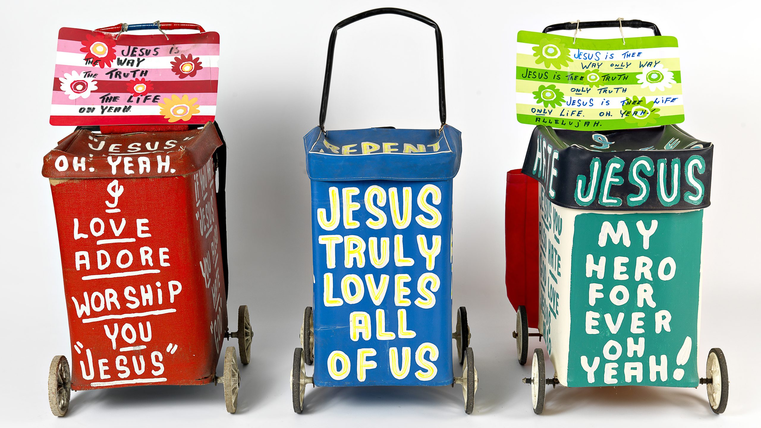
It would be all too easy (and unjust) to label Hynes’ work ‘outsider art’, to regard his considerable output over three decades as some kind of a naive street vernacular. But don’t be fooled for a minute. His work is far more knowing than what first meets the eye. Hynes understands the way that a gridded city such as Melbourne works – its sightlines are direct and clear, allowing for high visibility. This accounts for the extraordinarily generous and loud typographic coverage of every surface of his trolley, banner, flag, signs and even clothing. Add to this Hynes’ rich use of bright and often jarring colour across these ‘canvases’ and you have a truly immersive visual experience.
It is the hand-drawn letterforms writ large across every surface that make this work truly unique and, perhaps more importantly, imbued with an urgent humanity. It is a consistent typographic language, steadily refined over time and immediately identifiable as his and his alone. From the earlier years, when he festooned his Elsternwick house with myriad evangelical messages, through to his more nomadic pontifications on the streets of Melbourne (and other Australian cities), his message and the visual language through which it is communicated has been consistent and distinct. Contemporary marketers would swoon at such recognition and visibility in the marketplace (the street) – and yet Hynes appears to have been the designer of his own ‘brand’ from the very beginning.
His hand-lettering has not been borne by skill so much as by the kind of sheer resilience that can only be powered by faith. Having allowed time to finesse the lettering, its voice has become more and more confident and embellished as time has passed. But it fits no conventional typographic taxonomy; it is a non-linking script sans that is occasionally embellished with inlined strokes, dots and charming ornamental superscripting. Reflecting urgency and volume, the letters are almost always presented in uppercase, with a lowercase form emerging every now and then to playfully bring a gentler tone.
This is the lettering of a pragmatist. Hynes realised early on that his messages may need to be redrawn, repaired or embellished at any time and on any material, from canvas to cardboard to fabric, and be economic and self-managed. Painted letterforms suited all these criteria perfectly.
Unique though Hynes’ work is, there have been other significant Christian evangelist precedents who have employed typographic spectacle. The most obvious and relatively local is Arthur Stace (1885–1967), the evangelist who wrote the single word Eternity some half a million times over 37 years, while roving across the suburbs of Sydney. Like Hynes, Stace’s evangelism came from a deeply held need for redemption from a past ‘sinful’ lifestyle. Stace claimed to be virtually illiterate and that it was only through the power of God that he was able to write the word Eternity in perfect copperplate script. The singularity of Stace’s message has made it easy for others to use it as a ‘monetised brand’ for Sydney decades after his death, the height of which was its pyrotechnic reproduction illuminating the Sydney Harbour Bridge at the new millennium celebrations in 2000.

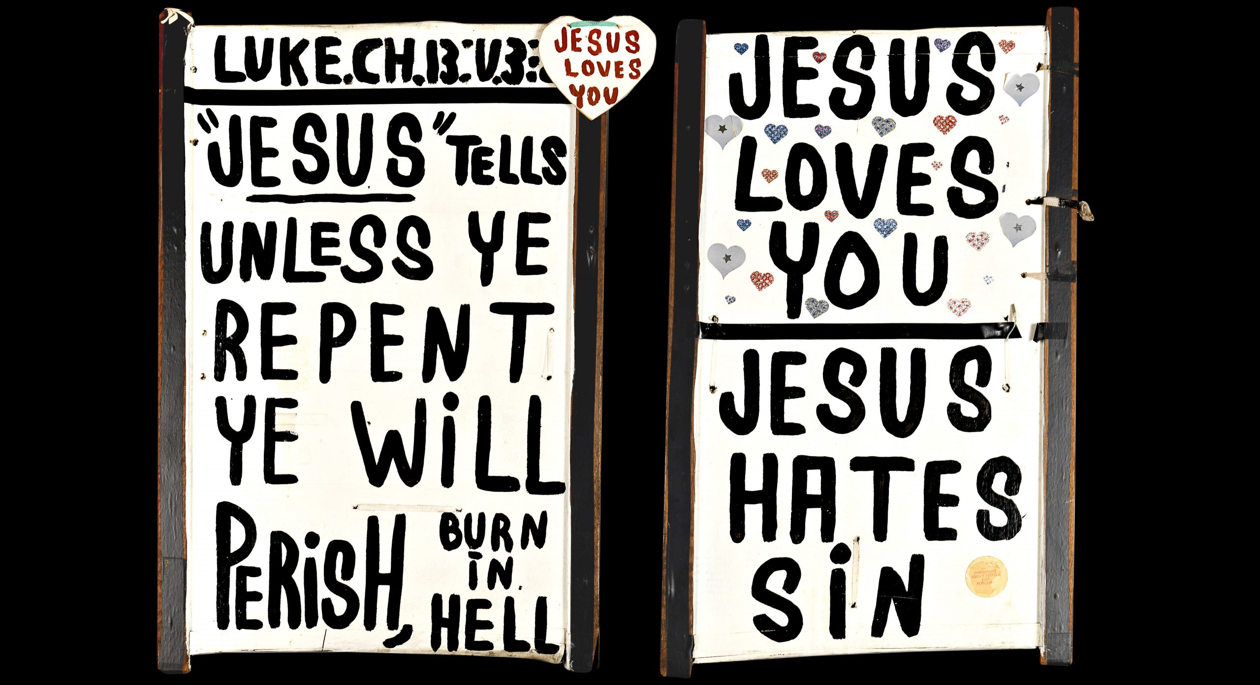
Untitled (Jesus tells unless ye repent). Desmond Hynes (c.1995) Enamel and acrylic paint on cardboard, timber, electrical tape, string , 71 x 47 cm. Collection of Phil Campbell.
Both Stace and Hynes took more than three decades to steadily refine their hand-lettering, viewing the letterforms as a ‘conduit’ through which the word of God is expressed. The intention of the lettering, however, never budged: to create a recognisable spectacle in the street, drawing attention to the message and not its maker. Stace’s message of Eternity is poetically open-ended in its interpretation and classical in its delivery. By contrast, Hyne’s blunt and uncompromising tone can often be at odds with the playfulness of the lettering. After all, it is difficult to soften proclamations such as Jesus tells unless ye repent ye will perish, burn in hell or Sin and the devil, Satan will take you to hell, no matter how delightful and whimsical the letterforms may be. Hynes’ physical presence alongside his lettered trolley shouting and gesticulating, lends it an immediacy that contrasts starkly to the quiet discovery of Stace’s overnight scrawlings on the streets of Sydney.
Another precedent to the typographical expressiveness of Des Hynes is the work of Sister Corita Kent (1918–1986), a progressive Catholic nun from Los Angeles, whose work from the mid-20th century offers both parallels to and extreme diversions from that of Hyne. Sister Kent’s work and inspirations came from a more educated and ‘design-aware’ context than Hynes’ (she ran workshops with the likes of Buckminster Fuller and counted Charles Eames and Ben Shahn as mentors). Although Kent’s work promotes a progressive social activism rather than a brutal evangelism, it is in her engagement with pop culture that shares some similarity to Hynes’ work. Both Kent and Hynes appropriate advertising forms and slogans to bring a sense of modernity and relevance to the intended message. Kent worked with metaphoric expressions of slogans and type, while Hynes cuts to the chase, presenting a more simplified binary argument. Hynes paints a single word upon a Shepard Fairey–designed ‘Obey’ baseball cap, which now proclaims to ‘Obey God’, while the ‘Big G’ logo that Kent appropriates from General Mills was to stress the idea of ‘goodness’ within humanity.
Des Hynes’ typographic contribution to the streets of Melbourne has been unique, and not just in an aesthetic sense through his joyous hand-painted lettering. More importantly, he cultivated a distinct typographic language that operates outside, and yet in tandem with, the commercial modes of communication design. His is the language of the individual engaging the many, a language of persuasion, where no matter how seductively curved the letters may be, the message is always blunt.