Piscatorial Two
design Letterbox | client Two Fish Management
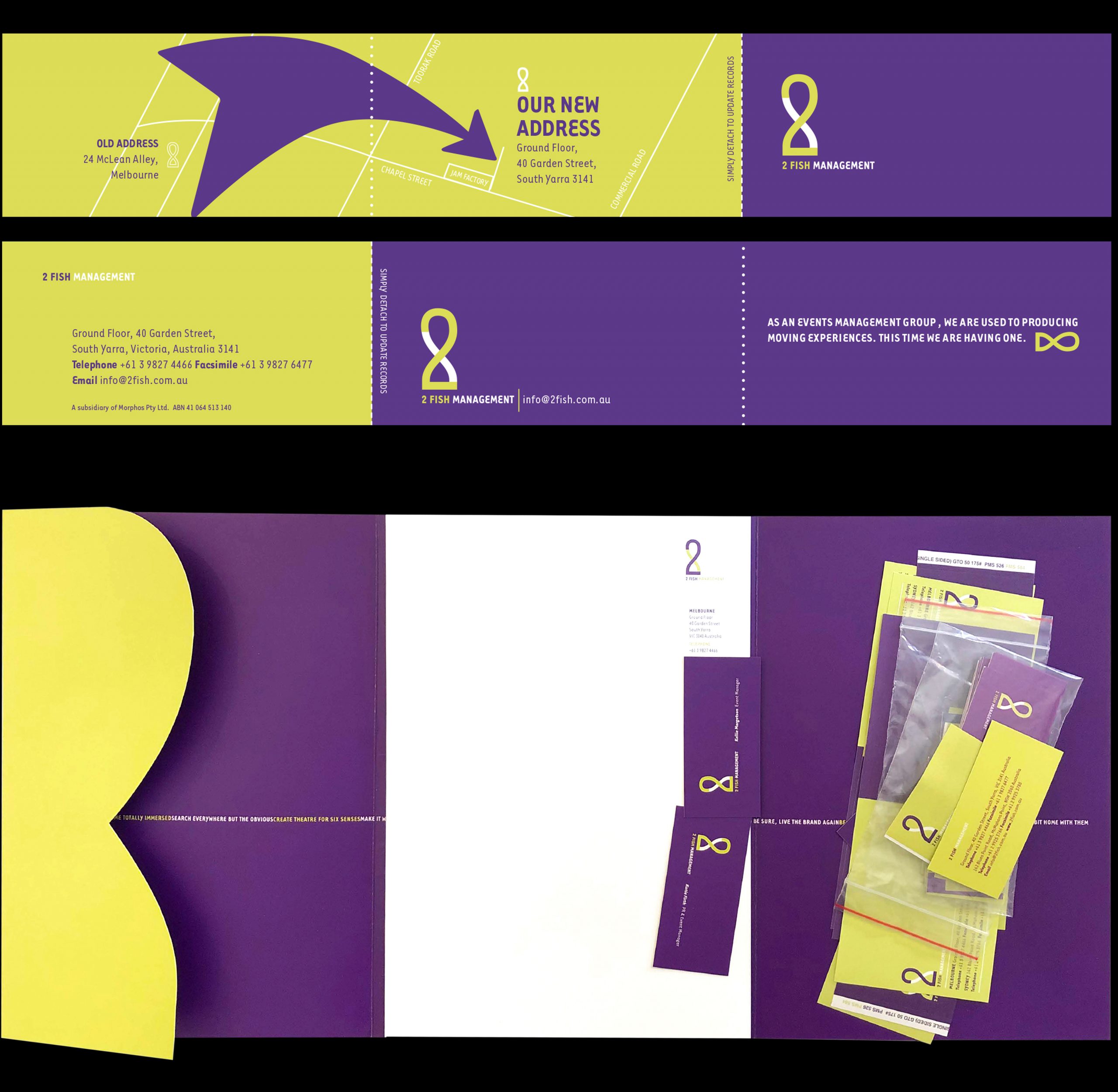
With an unusual name like 2 Fish, the identity for this events management firm called for an unusual approach. Carefully avoiding a literal or pictorial process, a typographic solution lay in identifiying specific numeral 2s that, when duplicated, produced a fish-like silhouette. The result was a deceptively simple identity, assisting the company’s communications as it expand into other cities and work on large-scale corporate and cultural events.