A Font of Knowledge
Interviewer Jane Sullivan Published The Age on 2 May 2009.
If it wasn’t for Esperanto, Stephen Banham wouldn’t have been born. His grandmother and grandfather met at Esperanto classes in the 1920s and his grandmother, who was the teacher, made a rule that when they were on a date, it was the only language they were allowed to speak..
“So in a weird kind of way, I’m here because of Esperanto,” he says. “I’m interested in learning it. My father hates it because his parents used it to speak to each other in code.”We are sitting in Brunswick, in the huge, airy space of Letterbox , the typographic studio he founded, talking about Esperanto, alphabets, typefaces and Utopias. You might not have thought these subjects had much in common, but for Banham they are almost magically linked. He admires dreamers and visionaries, even the wacky ones, and he’s a bit of a visionary himself, fresh-faced and fast-talking. “I can’t help but be a bit evangelistic about these things,” he says. “There was a time when I was a young kid I wanted to be a priest, and this services that want.”
Banham is a speaker at agIdeas 2009, the international design forum in Melbourne this week. At the same time, he’s bringing out his 14th little book, Utopia Oblique, about the link between language, typography and Utopia, and launching a new typeface, League, which is based on some of the features of Esperanto.
The new typeface (also known as a font) and the ideas in the book, he says, are big, bold, confident and optimistic – completely at odds with the dark, pessimistic mood of our times. Since he started writing the book, the global financial crisis has kicked in: “It’s becoming even brighter as a concept because it’s darker elsewhere.”
Banham’s dream is for us all to walk down the street and notice the typefaces everywhere around us, and what they tell us about our culture, in just the same way as we now notice things like cars, dress or buildings. “If I can say with my last breath that I’ve done that, I’ll be a happy man.”
Typography expresses the lives that we live, he says, but it’s so commonplace, we don’t see it: “It really is like air.” To spread the word, he has spoken at international design events from Barcelona to Beirut, New Zealand to New York. He has lectured in typography and run Letterbox since 1991, and has designed about 10new fonts. He and his staff organise exhibitions and events for film and design festivals and balance their own projects with work for corporate clients.
He’s frank about graphic designers doing commercial work: “Because we’ve turned into industry professionals, we’re used to telling the stories of others, instead of our own. It’s their stories – and very often their lies – that we perpetrate.”
Perhaps his most notorious campaign was his “Death to Helvetica” a few years ago, against the ubiquitous typeface that seemed to be taking over the world, but he’s not so cross about Helvetica any more. It was an important argument at the time, he says, but what was more important was that it spread the word about fonts.
Banham’s books are printed in limited editions of 500, but they find their way into libraries all over the world. “They’ll probably outlive me, they’re my children in some ways. I’m trying to create questions for other people to answer.”
He has coined the word “utypia” to describe what happens when the ideas of an ideal society meet the ideas of an ideal language, alphabet or typeface. Sir Thomas More, who conceived the perfect island of Utopia in 1516, was the first creator of a Utopian alphabet.
“It’s really curious and it’s totally dysfunctional, but it’s fascinating that he felt compelled to take that extra step.”
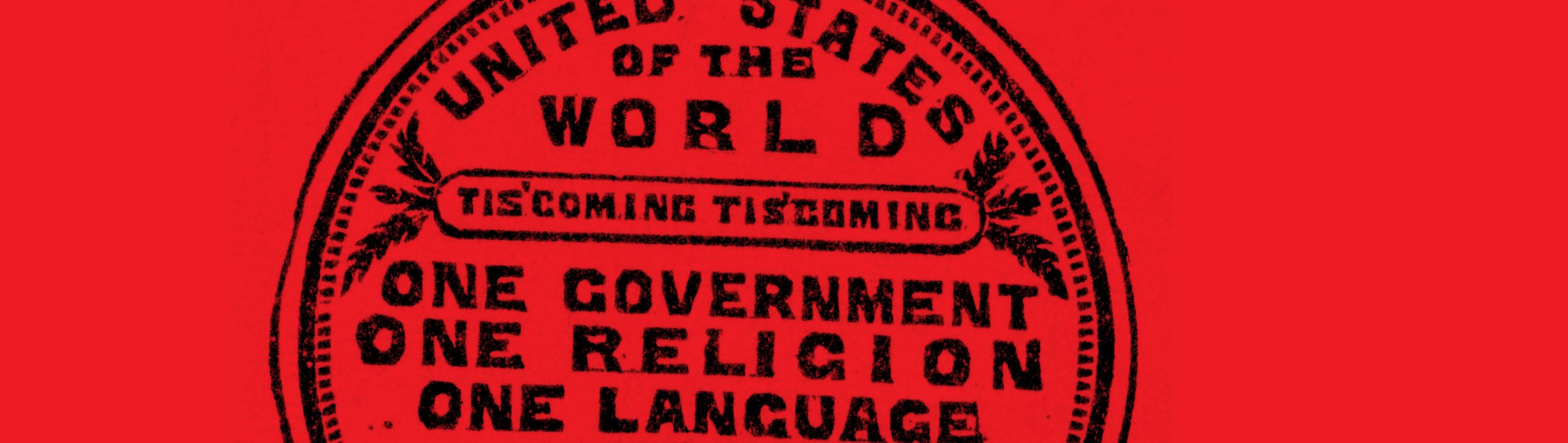
E.W.Cole, the eccentric proprietor of the 19th-century Cole’s Book Arcade in Melbourne, had an idea for a Utopian language. He distributed medals promising that by the year 2000, the world would have one government, one religion and one language. About the same time, L.L.Zamenhof was creating his own universal language, Esperanto, which was denounced by Hitler, Stalin and Joseph McCarthy.
It’s said that Esperanto has never been taken up as a national language, but Banham tracked down a “micro nation”, Rose Island, which spoke and wrote in Esperanto. Giorgio Rosa, an Italian engineer, created the island in 1968 when he built a platform on pylons, set it up just off the coast of Italy and declared himself president.
Rose Island had its own restaurant, nightclub, post office and stamps, but eventually the Italian authorities cleared everyone out and ordered the navy to blow it up. “After that,” Banham says, “Rose created an entire set of Esperanto stamps showing his island being destroyed.”
Typefaces Banham unearthed for the book include one for a Mormon alphabet, invented in 1854 to help new migrants integrate; an egalitarian font from 1920s Germany, which printed every letter in lower case; and Typeface26, which is phonetic. “All of them failed, but in the end it doesn’t matter – it’s about ideas.”
Typefaces he and his studio have created, such as Bisque and Berber, sell very well, he says. “Every morning I come into work and see who’s bought what, it’s exciting. It’s like being a chef and growing your own vegetables to create your own meals. It’s not lucrative, but it’s something we feel we have to do.
“All typefaces are born out of need. There’s a tiny gap in what at first appears to be an infinite font menu. It doesn’t exist, so you craft it yourself.”
It takes a long time – 12 to 18months – to create a typeface. The actual design of the letters is only about 5per cent of it, Banham says – the rest is working out the spaces that surround each letter, and how they relate to each other. The permutations seem almost endless. And then there is the widespread problem of piracy: “It’s pretty scary because there’s nothing stopping somebody downloading our typeface and before you know it, it’s everywhere.”
All the same, after 20years in the business, he believes that now is a fantastic time to be a graphic designer in Australia. The cultural cringe has rapidly faded, design has improved “a hundredfold”, and typography, once seen as a boring technical branch of the business, has now become popular, “almost sexy … Every time I hear my students moan and groan, I think, ‘You’ve no idea’.”