Font Fetish
writer Wilson DeSilva Published Black and White Magazine Issue 18 (1996)
False walnut panelling, circa 1930, bedecks the long silent hallway. Doors of plywood and frosted glass streak from the creaking elevator to a blank hardboard wall. The feel is very Barton Fink. At the end of the corridor is, if you pardon the pun, the headquarters of a very quirky magazine. A sporadic publication devoted to the art of typography, Qwerty is the creation of Stephen Banham – a lean-limbed graphic designer whose close-cropped hair and single cowlick gives him a passing resemblance to Tin Tin.
Banham is a good listener, politely waiting until the end of your sentence before speaking. His voice is rushed and his laugh a little nervous. He is 27. And he is the guy that European graphic art students festoon with praise and New York art directors want to hear from. Banham has just returned from a visit to Europe where he lectured to British students on the art of type. In the United States he addressed the prestigious New York Type Directors Club. And at the University Of Barcelona, Spanish students plastered the corridors leading to a lecture hall with posters declaring his name and that of the magazine. “Wherever I went there were all these posters lining the walls spelling my name,” he says with a partly chuffed, partly amused sigh. “They had these boxes with the word Qwerty stencilled everywhere, and they made little papier-mâché figures with the résumé I’d faxed them. It was a pretty impressive reception.” You don’t have to be Einstein to figure out that Banham loves the printed word. It’s a love that borders on the steamy. He talks about the “feel” of letters, their “smoothness” and “angularity”. It’s as if the 26 letters of the alphabet are his harem and Qwerty is, well, a consummation of that passion. Like many a love affair, it is an at times exorbitant, lavish, and very personal commitment — each issue is lovingly made by hand.
“Only 200 to 250 copies of these are ever produced,” Banham says, holding one issue gingerly in his hands. “They are composed by hand using the old bromide system — a very organic, finished art. There are elements to each one that are very individual. That’s my attitude to publishing.” He paces to the other end of the large open-plan room to search for back issues. The studio is on the seventh floor of a 1939 Art Deco edifice on the corner of Flinders Lane and Elizabeth Street in downtown Melbourne, a stasis field that somehow survived the frenzy for glass and steel now dominating the street outside. Bright sunlight gushes into the corner office from the open windows, and Banham goes light and dark as he passes through the shafts on the way back to his seat.
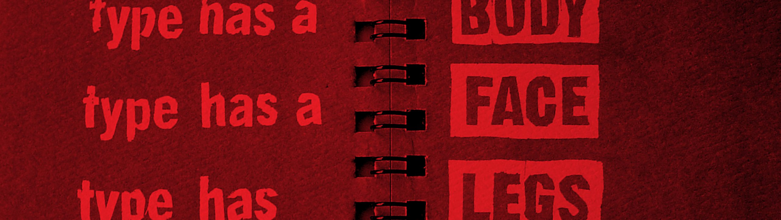
Every issue of Qwerty is very different, as one soon realises from the portfolio. Each is ascribed a letter, all six spelling out Q-W-E-R-T-Y. Individually numbered, stamped and packed, there are tall ones and fat ones and double-jointed ones. Each has an individual name too: number one is dubbed For Those Who Like Their Fingers Dirty, and looks at the beauty and individuality of hand-rendered type in a digital age. Number five, the ‘T’ issue, is called Big Is Beautiful, and is a catalogue of the largest letters in Australia, from A to Z. There have been six since 1991, each published about 18 months apart. They began as a personal art project. Banham, then a lecturer at RMIT University’s School of Visual Communication, was annoyed to see his students rush to mimic overseas design and typography trends. Nothing was happening in typography in Australia, he heard them complain. “I’d see them buy very expensive overseas publications on typography and copy them straight into their work,” he said. “I was a bit peeved about that because I didn’t think the students were reflecting their own culture. So instead of complaining, I thought I’d do something about it.”
The first Qwerty was tiny, an A7-size notebook. The reaction was favourable enough to enable Banham to bring out another the following year which focused on vernacular, “type that is produced by people who have no formal training in design at all”. Vernacular is a particular passion of Banham’s. The almost unreadable hand of bookies, collected from discarded chits at the racetrack, is an example. “I see that as quite a beautiful composition, and yet it hasn’t been designed by a graphic designer in a groovy studio somewhere,” he says, holding a chit to the sunlight. “This is distinctly Australian. It’s part of our culture.” By number four, Recession, featuring ‘shadow’ letters based on the glue globs left behind by tearing off commercial signs as companies went out of business, Qwerty was being noticed in the rarefied world of typographic high art. And not just in Australia. Bookshops in Germany and Britain were stocking it, and the European design magazine Eye went on to call him a ‘typographic evangelist’. “Banham has a great passion for genuine Australian typography,” says one commercial designer. “Australian graphic design students too easily adopted overseas trends or were too influenced by them. Qwerty’s had some effect in that area. But things like that are great for self-promotion too.” Qwerty has certainly brought Banham fame. But great big wads of cash haven’t followed. The cover price ranges from $14 to $20, depending on the issue (some are more expensive to make than others) and all the money goes back into the kitty to produce the next one.
So what made Banham such a font fetishist? It certainly wasn’t the graphic design course at RMIT which he completed in 1988. “That course didn’t really teach me anything at all,” he says, with a hint of distaste. “Not one thing, in fact it was three years of frustration.” From RMIT he went to designing press advertisements for The Herald & Weekly Times group, long since swallowed by Rupert Murdoch’s global media octopus. “We would have to set 200 words of copy in an ad about the size of a postage stamp,” he recalls. “And we had to make it look good too. It was just nuts! But the good thing is that it taught me a lot about the real economy of typography because you can’t afford to use the grooviest font. “That kind of stuff wasn’t taught in college. Instead you had these dream clients who are all very nice and appreciate creativity, for whom you’d create these fictitious ad campaigns. So it really hits you when you get out into reality.” In October 1989, after eight months on the job, he threw it in to go to Berlin. As the Wall came down he met typographer Erik Spiekermann and got hooked on type. For four months he collected German catalogues and magazines, cut out letters in different typefaces and moved them around on his kitchen table to see how they could fit together. “I spent months hand-kerning and hand-lettering type, composing pages and pages of it. That taught me, through scarcity of resources, a certain discipline that I still use now. It taught me to design it by hand first, compose it in my mind, and then move to the more high-tech stuff like Macintoshes. It taught me how to get back to the basics. At the time I didn’t appreciate it.” He returned to Melbourne in 1990 and worked for a few design studios while continuing his typo-graphic experiments. He fell into teaching at RMIT for four years before striking out on his own last year with Letterbox, the design studio he shares with illustrator and long-time friend Sonia Kretschmar.
Banham has just produced the ‘Y’ issue, Staying At Home With The Alphabet, which looks at the hidden typographic beauty of the home. It is the last in the six-part series, but not necessarily the end of Qwerty. The first task of the magazine, or booklet, as Banham likes to call it, was to study Australian typography. That done, Banham and Letterbox may move on to tackling international projects with some of the contacts he has made through Qwerty. Banham says it began as a personal art project with no commercial aim and no business plan, a non-profit labour of love. That’s exactly how he would like to keep it.