13pt: Thirteen Typographic Tales
writer Stephen Banham published Meanjin 73.2 (2014)
Back in 1991 a friend of mine who had no formal design training had found work in the then-burgeoning desktop publishing industry. Knowing very little about typefaces, he then set out to develop his own way of ‘learning on the job’. His idea was simple – to work his way through the font menu systematically with each job. So that as a new project came in, he would simply scroll down to the next font on the menu and use it. The next job he worked on he would use the font under that and so on. A logo set in Aachen would lead to the next being in Abadi MT, Akzidenz Grotesk to American typewriter and so on. He is currently at University Roman.
looks just like us.
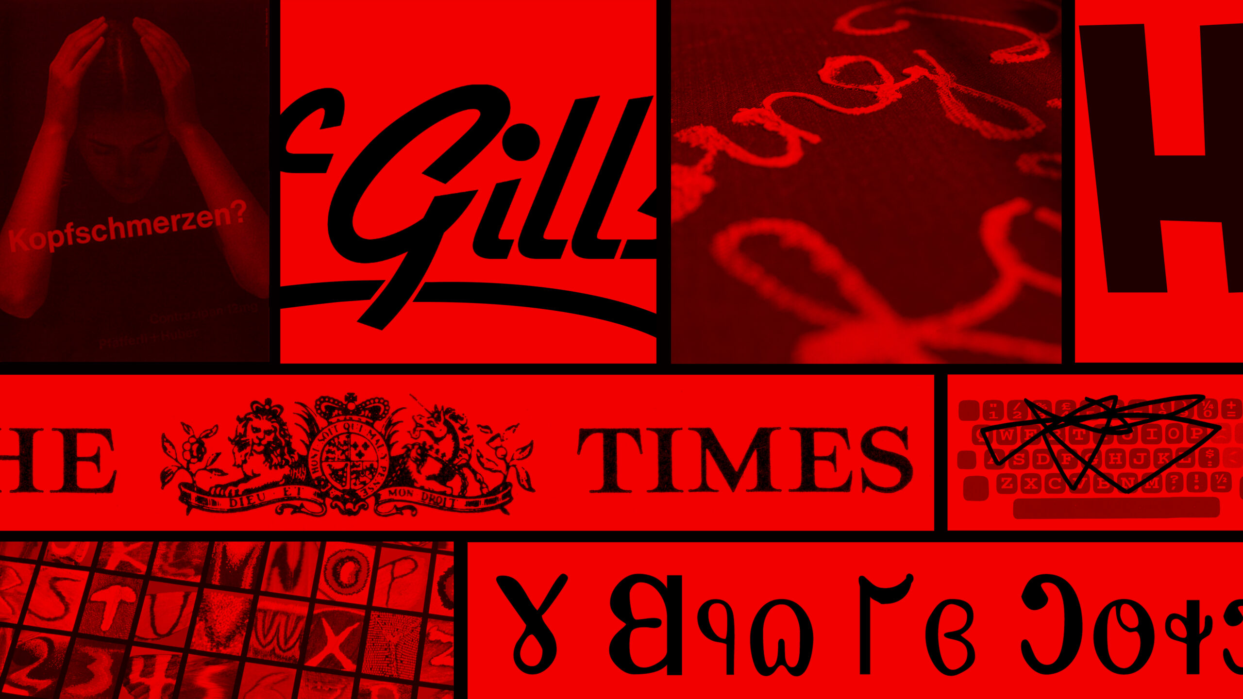
One bookshop that has slipped awat from our streetscape is the McGills Bookshop. You may have even been in one. And you may have seen their corporate identity and thought nothing of it. But the McGills logo was in fact a rare occurance of an odd phenomena known as ‘Typographic Onomatopoeia’. This occurs when a typeface is chosen because its name happens to match the name of the company it represents. In the case of McGills Bookstore they chose the classic Letraset script Gillies.
taking the point
The English type designer Stanley Morison (1889-1967) is most known for his contribution to the design of Times, a typeface specifically designed for the newspaper of the same name. But it almost never happened. When asked by the Manager of The Times, William Lints-Smith whether he would join the paper as a typographic advisor, Morison’s acceptance was conditional, stipulating that he would only take on the job ‘if you take the full point out after the paper’s name….’. The full point was promptly omitted from The Times masthead and so began a new age of typefaces customised for specific publications.
Other near refusals can be used very cleverly indeed.
In late 1958, the Swiss designer Ernst Bettler was approached by the pharmaceutical manufacturer Pfafferli+Huber AG to design a running set of posters celebrating the company’s 50th birthday. He was already aware of reports concerning P+H’s involvement in tests carried out on prisoners in concentration camps less than 15 years before, and when the telephone call came, was going to tell the would-be client to ‘go to hell’. Instead he formulated another strategy. He accepted the job (offending a lot of his left-leaning colleagues) and set about designing the set of posters. Knowing that these posters were going to be seen in hundreds of sites as a set of four, each of the posters was presented individually, deemed inoffensive and given approval. The first of these posters featured a clowning child’s body forming a shape similar to an ‘N’. ‘Kopfschmerzen?’ (Headache) asks the second of the posters, depicting a woman’s head bowed inside an ‘A’ shaped triangle of her forearms. In the third, the contortions of an old man formed the letter ‘Z’ whilst the last one in the set depicted a the silhouetted profile of a defiant woman (forming the letter ‘I’). When pasted up across the city, the previously concealed result was dramatic. The public response was equally instantaneous – the posters were torn down, the local newspaper offices were buried in letters of complaint and demands were made for some of the company managers to be stand trial. Unfortunately this whole story was revealed soon after as a hoax.
The fusion of form and meaning makes typography a powerful tool for subversion.
Between 2000 and 2003, a series of chance sightings of odd typographic gluey messages occurred across vacant Melbourne shopfronts – ‘1995 if you’re lucky’, ‘Going down fast, 1997-2000’ and the largest of them all ‘2 years at most. 1991-93’. It transpired that a signage installer has been casting his own prediction as to the duration of the new businesses. Written in the very glue that once held up their signs, these mysterious forecasts were only revealed once the business has collapsed and signage removed. It is then that the general public, and more specifically the business owners, were exposed to these ominous forecasts. Perhaps the most haunting aspect is their sheer accuracy. In the case of Collingwood-based belt manufacturer Leathercraft, the glue forecasts drawn under their signage simply stated ‘1992-98’. The factory had indeed opened in 1992 and lasted six hard years until 1998 – when the company went into liquidation, forced out of their traditional markets by cheaper imports and higher labour costs. As Tony Larsden, the managing director of the now defunct Leathercraft described “I couldn’t believe it when we pulled the sign off. At first we thought it was just grafitti until we realised that it was written with the old glue. Seeing those dates scribbled up there was like some sort of spooky premonition – like looking at your own tombstone”.
Some type terrifies. Some inspires.
Roman Kingsley from Adelaide has been a bird trainer since 1978, regularly competing in national bird competitions and recently struck on an interestingly typographic idea when on holiday in Perth. “I was looking up at the sky and saw a plane skywriting these puffs of white smoke in the sky. Those cute little puffs reminded me of Bert and Busby, my two main prize winning birds. I thought, my birds could do that, spell words out, with a bit of training. After all, flying in a V formation every winter comes natural to them. It’s only a short jump from that to get them to spell out other letters and then maybe entire words”. Conventional skywriting can only appear in one place at one time, whereas Kingsley’s birds can assemble and reassemble at any point spelling different things out anywhere else. Despite some teething issues (trying to get the birds to spell was difficult) it took three months for Kingsley to train the birds to spell out a word in the first trial. “We definitely prefer our advertising clients to have straight letters in their name. The birds don’t like too many curves”. But Kingsley remains ambitious. His client wishlist featuring such companies such as ANZ, AAMI, NIKE and IKEA – all clearly showing a strong inclination for the linear, peaked letterform.
But visual tracing of typography has been investigated before.
In 1963 a series of experiments were conducted to compare the human and mechanical energies spent when typists used manual and the newly developed electric typewriters. One of these experiments was kine-cyclographic, whereby tiny lights were attached to the middle finger knuckle of the typist as (she) typed out the pangram ‘The quick brown fox jumps over the lazy dog’. These were then filmed and turned into a simple motion diagram. One of the young English secretarial typists involved in these early experiments, Veronica Lascelles, was so taken by the findings, published in T.L Kinsey’s Audio-Typing and Electric Typewriters (1964), that she decided to privately continue these experiments. Between 1968–1984 she has tested the human energy required for the operation of modern computers, morse code transmitters, fax machines and several types of cameras. In 1989 Lascelles took Kinsey’s tests a step further, applying kinetic mapping to everything from a hot metal compositor’s type tray right through to the keypad of an auto-teller machine. The outcomes offer possibilities of visually representing words through the physical movement required to make them. Or as Lascelles puts it “It’s the human element that is often forgotten first. A sense that it’s a performance. Like a dance”.1
Type from nature.
It was in 1962 in an attic in the Smithsonian Institution in Washington DC, where Kjell Sandved was balancing high on a ladder, surrounded by drawers and boxes full of exotic butterflies. Upon opening an old cigar box, there he found something extraordinary woven into the tapestry of the butterfly’s wing: a silvery, gleaming letter ‘F’. ‘I looked under the microscope at this miniature design,” Sandved recalls, “It reminded me of how the ancient scribes lovingly embellished letters in bibles and illuminated manuscripts with human and animal forms.” Intrigued, he photographed the letter and hung the print next to his desk where he admired it for over a year. Then one day it dawned on him, that having found one letter of the alphabet, there might be others flying around. Inspired by this curiosity, he decided to follow this curiosity and collect the entire alphabet on the wings of butterflies. In order to avoid the eventual fading that occurs on butterfly wing specimens when handled by human hands, he realised that he would have to photograph the butterflies live in nature and do so without killing them. Loaded with customised photographic equipment, Sandved embarked upon a quest that would span more than 30 countries. Year after year, letter by letter, Sandved found and photographed these elusive letters on the wings of butterflies. Finally after 24 years he had found the entire alphabet. The most difficult of all was the asymmetrical ampersand ‘&’. He found only one.2
Type from God.
In Paul Auster’s New York Trilogy, the private detective Quinn (aka Paul Auster) is intrigued by the seemingly meandering daily wanderings of his target (Boston Stillman). It is only after he carefully follows and maps the movements of Stillman that Quinn discovers the route his target is taking is actually typographic – spelling out the phrase ‘The Tower of Babel’ using the block grid system of Manhattan. The resulting map of Stillmans travels is a strangely familiar pixel-like rendering of type, combining both topography and typography.
Even the Mormons created their own alphabet.
The Deseret Alphabet emerged from the Church of Jesus Christ of Latter-day Saints with the stated intent to help simplify the process of learning and spelling of the English language. Unfortunately, church members never fully accepted the new alphabet. Some critics have also claimed that this alphabet was intended to cloak Mormon writings from outside view. Soon after the death of its creator Brigham Young in 1877, resources and funding for the project came to an end. Recently included in the unicode system, the letter forms was last seen adopted by the comical republic of Molossia as its national language.
Upper case, lower case, pencil case.
Pencil case manufacturer, Spellit has recently had to adjust the design of its school pencil-case range to accommodate the ever-growing length of children’s names. When the company first brought out the cases, whereby children would spell out their name cutting out supplied cardboard letters, names were shorter on average by two letters. ‘The 1970s were the days of John, David and Sally’ remarked the Spellit’s distributor manager, Barry Sandilands. With popular names now growing to eight letters or more, the pencil-cases simply had to be made longer. ‘Increasingly, the cases have to spell out names like Sebastian, Annabelle, Harrison, Alexander, Mohammed, Isabelle and the like. It’s not that pencils are getting longer, the names are’.
The full stop.
The only person known to have used typography to kill themselves was the young Hollywood actress Peg Entwhistle. On September 18, 1932, after a night of depressive heavy drinking following several casting rejections, Peg scratched her way up the Griffith Park mountain slope to the monolithic Hollywood sign where she took off her coat and folded it neatly. She placed it, along with her purse, at the base of the maintenance ladder which led up the letter ‘H’. She then climbed up the workman’s ladder on the back of the 45 foot letterform and dived head first onto the ground killing herself instantly. Peg was only 24 years old. Shortly after her death a letter from the Beverly Hills Playhouse arrived at her home. It was an offer for her to star in their next production, playing a young girl who commits suicide.
The fool stop.
On 1 April 1977 The Guardian published a special supplement honouring the tenth anniversary of the independence of San Seriffe, a small island republic located in the Indian Ocean. A series of articles affectionately described the geography and culture of this obscure nation. It was said that San Seriffe consisted of two islands: Upper Caisse and Lower Caisse. Its capital was Bodoni, and its ruler was General Pica. Included in the supplement were paid advertisements by prominent companies. For instance, Texaco offered the public the chance to win a two week trip to Cocobanana Beach in San Seriffe, and Kodak asked readers to send in their favourite pictures from vacations spent there. The Guardian’s phones rang off the hook all day with readers eager for more information about this idyllic island.
1. The text for this article is based on T.L Kinsey’s Audio-Typing and Electric Typewriters (1964) as well as a telephone interview with Veronica Lascelles on 30 October 2003.
2. This text is based on the writings of Barbara Bedette and a phone interview with Kjell Sandved in Washington DC (4, October 2003).