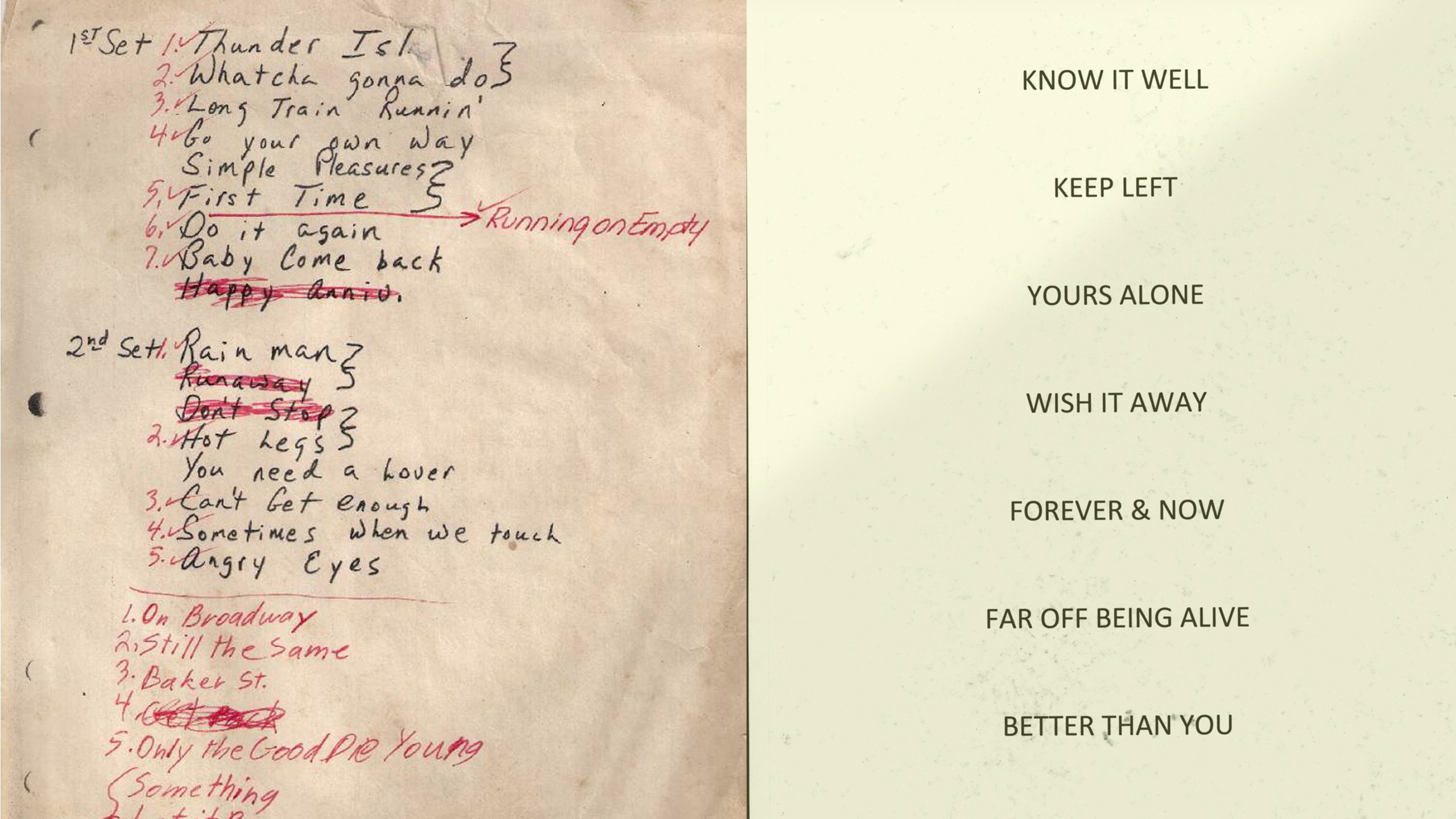
After the Gig
writer Stephen Banham published Desktop Magazine Nº 281
Nothing excites a graphic designer more than a visual language of systems and informational order. You only has to see the endless folios sporting Feltron-esque graphs of ‘what I did on my holidays’ or ‘why I want to work in your studio’, laboriously embellished in diagrammatic form. Second only to diagrams is the graphic designer’s love of lists. And so it is little wonder that designers have created a whole aesthetic subculture about lists.
These vertical towers of presumed order serve as an outlet for the graphic design fetish to give hierarchy to information, no matter what it may be. Many of these are little more than an excuse to give graphic form than to actually inform. ‘A list, especially one that ranks or categorises, can be a salve for the anxiety of living in an era of information overload. But the relief is short-lived. Listing the options is not the same as selecting one of them to stand by. Unless you have something to say with your list, the experience of both its creation and use ends up being hollow’1.
One of the more pragmatic kinds of list however is the ‘setlist’ – the order of songs bands intend to play during live performances. Like an album track listing, the song sequence is not accidental, orchestrated as it is to maximum effect. From a typographic point of view, these artifacts of performance also offer us some interesting insights. Usually scribbled usually by hand a few times over (one distributed to each band member) these lists are living and dynamic in nature, often featuring spontaneous revisions – the swapping, cutting or addition of songs as they see fit. As lists that are kept and read long after the gig, they operate as ‘typographic maps of the night that was’.
Like much of graphic design, setlists are dismissed by many as merely ephemeral. But there are enough serious fans and groupies out there to have fostered a lively subculture around these objects. It is not only this immediacy and intimacy (it is after all meant only ‘for the band’) that makes them highly attractive to collectors, setlists also signify one of the very few ‘unbranded’ artifacts of the music industry.
Unknowingly, the appeal of these lists fits perfectly into an age where people yearn for authenticity and experience rather than ‘stuff’. They are after all a raw typographical personal experience of the band. Some lists have even been known to feature some ‘bonus extras’ – such the footprint of the band member, creating an accidental autograph to the collector.
For those very familiar with the listed songs, reading a setlist it becomes a moment of typographic synesthesia – where one can hear the music whilst reading the words. For those unfamiliar with the music, the experience is more akin to reading a somewhat baffling stream of consciousness.
Setlists have also appeared in contemporary art. Painter Jon Campbell has astutely re-interpreted them over many years, drawing upon his personal collection of lists as well as direct experience of playing in a band. “If it’s a found sign or saying I like to try and stay true to the original typographic design when I re-use it, but changing the colours and size and support”2. By this referencing, Campbell is acknowledging that setlists have a much greater life beyond the performance itself and in doing so, elevating their cultural status from ‘humble ephemera’ to a valid form of typographic expression.
I recently picked up a set list off the street outside a Brunswick music venue (above right image), only to find that the computer has now entered the equation. And although those evenly spaced lines of type sat lifelessly on the page, it was perhaps time to reconsider that times had changed. That with the advent of itunes purchasing and live music being the only way of bands to economically survive, a setlist may well be the closest thing to packaging some bands get.
1. Tremlow, A. Vertical Writing, Eye Magazine, Issue 47. Vol 12 Spring 2003. p.38
2. Radford. L, Rawlins. J. It’s about design: You’re talkin about nothin, I’m talkin bout everythin. Words and Objects. Jon Campbell, Uplands Publishing, 2010. P.71