
Australian Graphic Design B-Sides Nº3: Name
AT: Andrew Trevillian | MM: Matthew McCarthy | sb: Stephen Banham (interviewer)
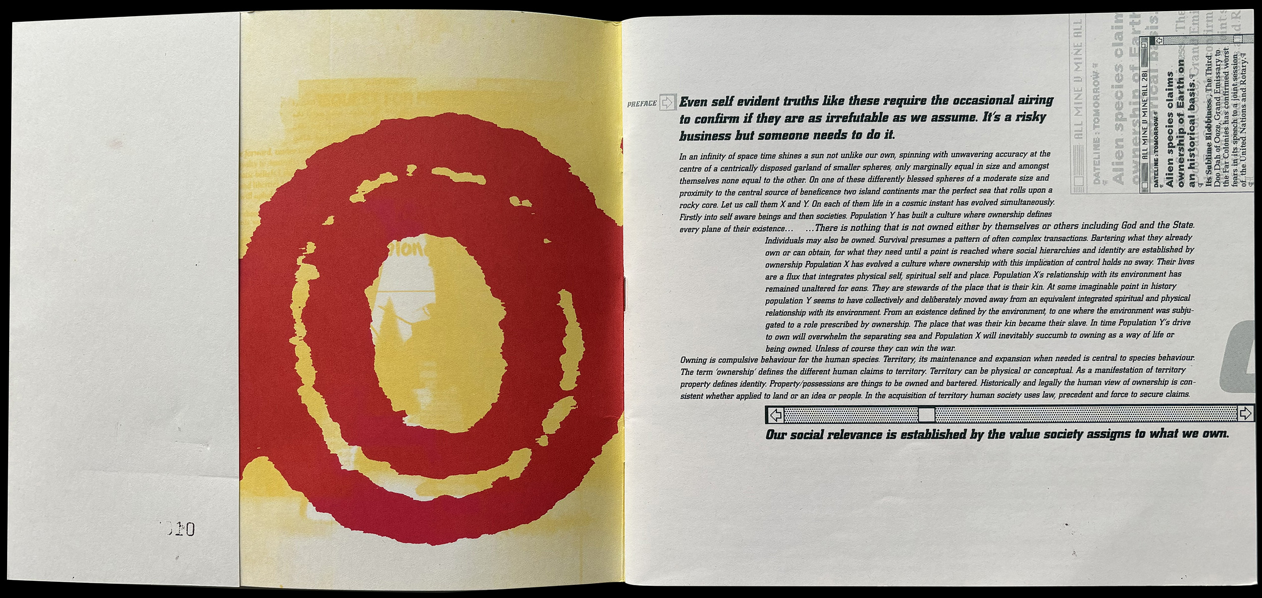
The mid to late 1990s. The emergence of digital design tools. A complete re-thinking of design. Responding to these dynamic times, a curious graphic design magazine emerged out of Melbourne. Simply called Name, it published four issues under specific themes – Name, Identity, Evolution and Ownership. I sat down with two of its founders, Matthew McCarthy and Andrew Trevillian, to discuss the why and how of Name.
SB | With 30 years hindsight, how do you think Name has contributed to Australian graphic design?
MM | Well, the initial idea was to publicise the interesting work that people around us were doing. In many ways, it was about making connections, meeting people and working with them to build something that would help facilitate emerging talent.
SB | And do you think the contributor model in Name helped or hindered you in that process?
at | Emigré were doing kind of interesting take-overs with designers and various otherStudios. And that kept Emigré fresh – each issue would be dramatically different from the previous one.
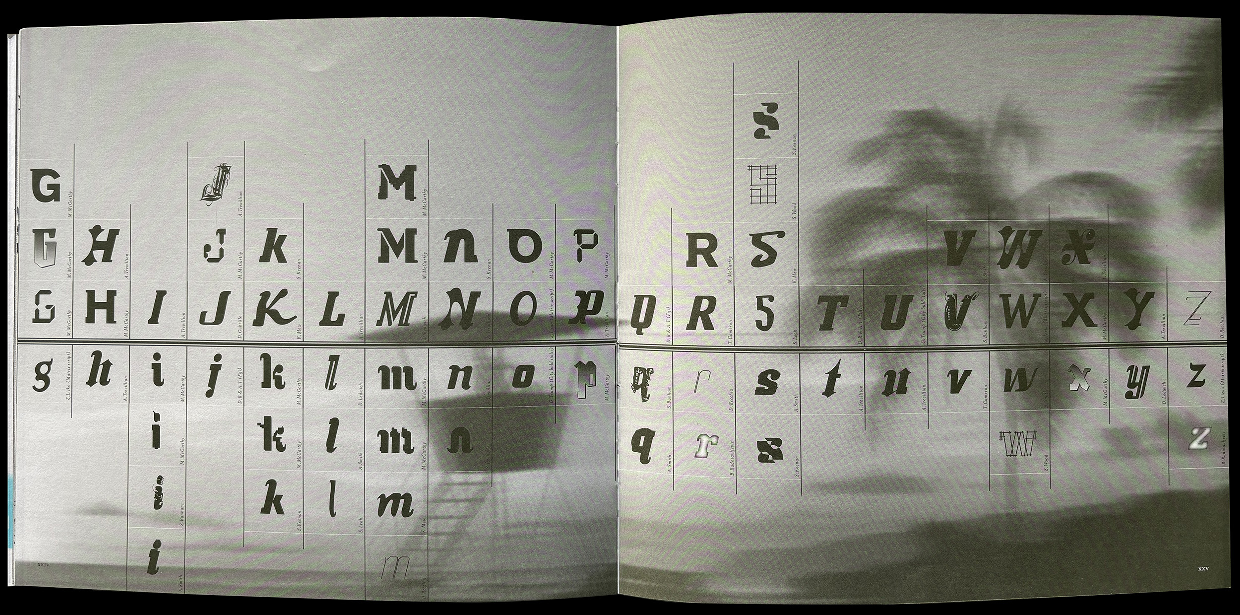
mm | At the time, we were students at Swinburne (University), and there wasn’t any student representation in the selection process of graduate work. It was only the ‘powers that be’ selecting what they deemed to be commercial work’. And that was frustrating. It wasn’t that our work was ‘industry ready’, but we were not interested in the visual language of the time that would get us a ‘studio’ job. ‘Doing it yourself’ was our catalyst, and we embraced being the first computer generation going through Uni. And from a process point of view, Andy was at Cozzolino Ellett Design doing an Industry placement. At the time, he was learning all these great print techniques with colour, exploring image-making fused with the freedoms of the computer. We were in the cultural context of you (author) doing Qwerty, Mimmo is doing Symbols of Australia, Tony Ward making provocations… And then, on the commercial end there was Andrew Hoyne, Stephen Cornwell, etc as well. Name started as an amplification of what it is to be an ambitious design student. We were excited to make an impression. Three or four of us would get together every weekend to debate Australian graphic design’s merits. Those conversations were seminal.
SB | Do you think that Name actually had its desired effect? Do you consider it a success, whatever that means?
at | It certainly wasn’t designed to be a commercial success. But I think it was a success in terms of learning to talk about design, learning to collaborate, and acquiring those important soft skills as well as the hard skills of production. We independently published and sold it through Greville Street Bookstore (Melbourne) and Ariel Booksellers (Sydney).
mm | We gave away ten copies to AG Ideas and Ken (Cato) who was very supportive of us. Name helped to position us differently from our cohort. We weren’t entirely conscious of how much of a commitment it was for us. We enjoyed working late nights in each other’s bedrooms, lounge-rooms or kitchens, trying to find our own voices as graphic designers. After all, why couldn’t we compete with Neville Brody or David Carson? What was the Australian design visual language? Why wasn’t Australian graphic design being championed? We hoped to generate a more significant awareness of local design.
SB | At that point in history (1990s) there was a huge generational shift. Do you think there was our own Melbourne version of the Vignelli vs Émigré debate?
at | I think so. But all are facilitated by the freshly available digital tools. We were really interested in creating our own identity. We were really fascinated by that Australian design identity. And Melbourne identity. And there was no internet. We’d send faxes to designers overseas discussing the merits of Australian design, and it would take days, weeks, months, or never to get a response. And I think that process was something we tried to capture in the work as well –a kind of fusion of analogue and digital aesthetics.
SB | What about the all-important role of naivety?
mm | Ken (Cato) brought out a diversity of studios to Melbourne through AG Ideas, and that event made a significant contribution to the local design discussion. In contrast, Garry Emery was a consistent model of design excellence. The naivety, or unbridled enthusiasm for design, drove us, helped build our profile amongst our peers, and created a talking point with the generation above us. It was our vehicle towards being design literate. For the first three issues, we were being naive about the expectations. By the fourth issue, we were too conscious of it. Something changed, and the moment passed. Somehow, upon graduating, our expectations for Name changed. Our passion moved towards a feeling of being obliged.
SB | Isn’t there’s a deep irony here – we all felt compelled to be sort of anti-industry as a way of getting into the industry…
mm | Part of the legacy of Ken was that he brought out all these design ‘rock stars’ who were rebelling, you know?
at | There was this rebellion fermenting with Stephen Heller and the Cult of the Ugly etc. And we were riding that wave. Name wasn’t trying to tear anything down.
mm | We were fearless and wanted to help shape graphic design. I would see a studio published in Émigré and say, ‘fuck, that’s the definition of success,’ and I want some of that.
SB | How much of Name still lives on in your design thinking and processes today?
mm | A fascination with print, especially its ephemeral permanence. Andy and I were commissioned to design an annual report for 200 Gertrude (now Gertrude Contemporary) based on the Name format; Nation Fender Katsalidis engaged us to present the redevelopment of the MCA (Sydney) building upon the Name visual language.
SB | If you were students right now, would you do this again, or would it even be possible?
at | I think it would be possible in an infinite number of new ways. I mean, print production is much more accessible in a short-run context. But if we move away from the medium and talk about the passion… we were so motivated by it. It’s our version of ‘getting a band together’. Just the instruments now would be very, very different.
mm | Remember, Name was also just before fanzines and short-run. The production processes available informed the design outcome.
at | Memories for me include arguing with you (mm), making up and all that stuff. Scrambling to screen-print the titling on the last day before the opening at Lounge.
SB | But if you were to do it now and it was just a website, after two, three, five, ten years, it would no longer exist. Having said that, Name magazine is virtually invisible online anyway….
at | Yes, it’s not really super Google-able, is it? However, that was the underlying joke of the magazine called Name.

This interview took place at the design studio Clear in Fitzroy, Melbourne | Monday 17 March, 2025