Imaginary Alphabets
interviewer Stephen Banham published Desktop Magazine Nº 284
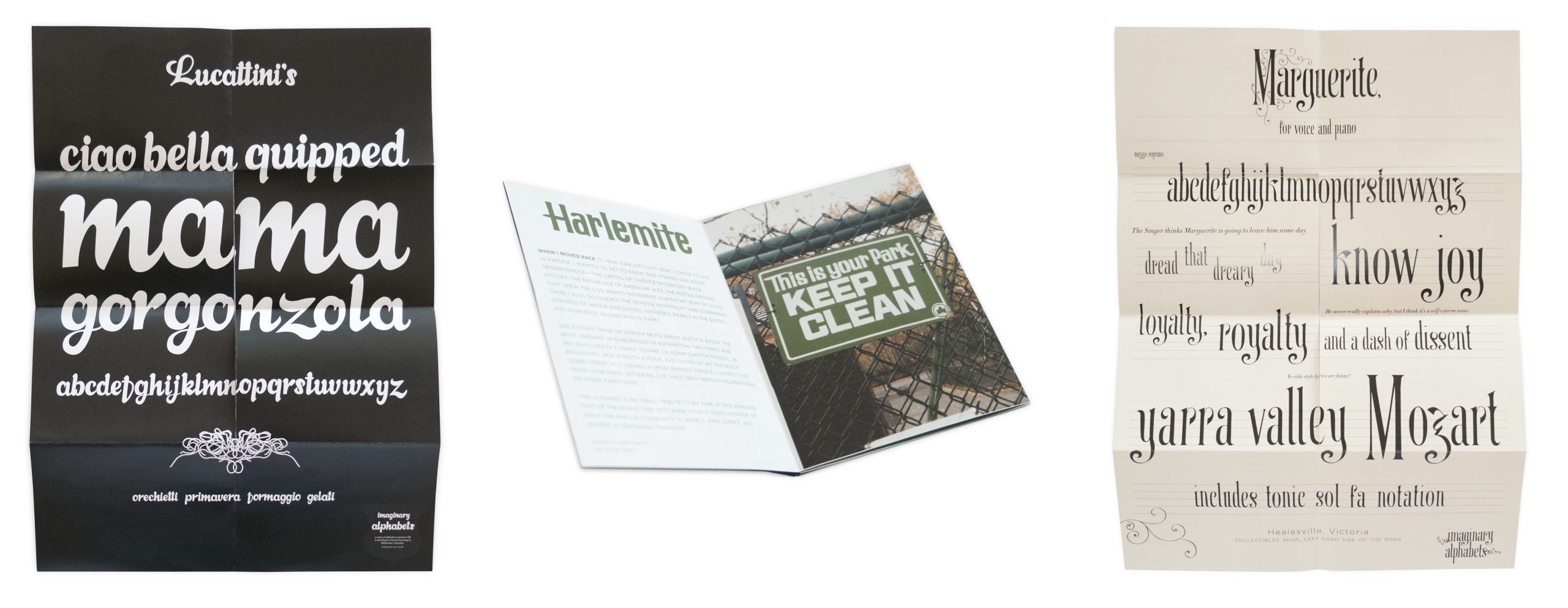
Ever walked past a hand-drawn sign and thought that it would make a great typeface? Elizabeth Carey Smith did just this over a number of signage sites in Melbourne, producing entire alphabets as a series of posters known as ‘Imaginary Alphabets’.
What was the reasoning behind Imaginary Alphabets?
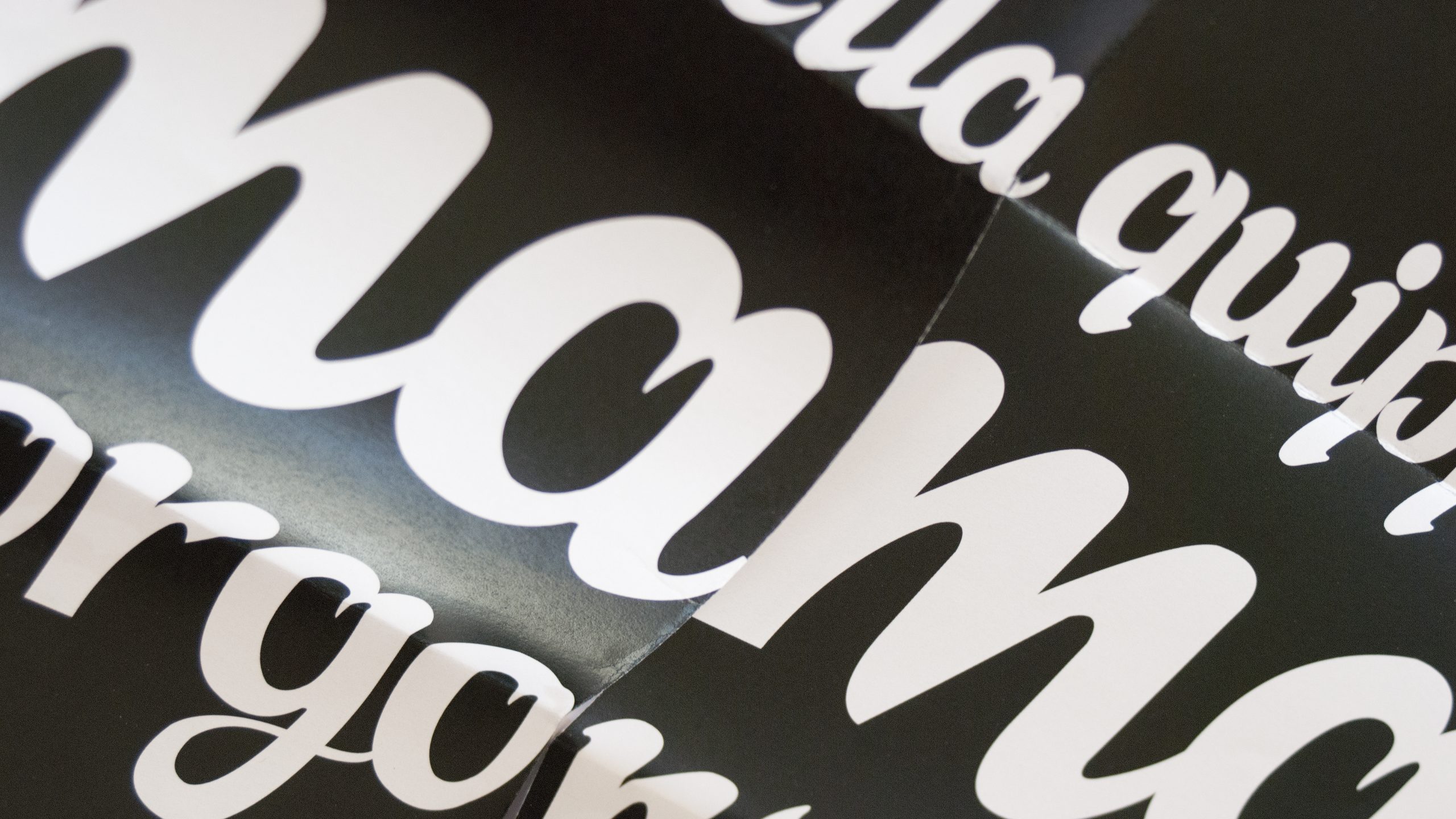
Was it a reaction to being an ‘outsider’ (beyond Melbourne)? I started the project because as a new freelancer I wanted something productive to occupy my time between projects. I’d been thinking about it vaguely for some time, and thought I’d act upon it. I’d walked by that Luccatini sign a number of times and always marvelled at the script; to this day I’ve never seen another like it.
What inspired its formulation/design? Were there particular precedents that you built upon?
Even though I’ve always been a type and letter-based designer, (in my thinking process anyway) I hadn’t drawn many letterforms since leaving art school in 2002. Certainly not full alphabets. The project became a challenge to see how much existing structure was needed for me to ‘fill in the blanks of found lettering’, which became the tagline to Imaginary Alphabets. I started thinking about the letters as 26 children, who all had to look related, but of course retain their own personalities. There may be other similar projects out there, but when I come up with an idea I purposely don’t look around the web. I don’t want to skew the results or damper my enthusiasm, so there were no precedents aside from the challenge itself, and of course wanting to maintain a quality that type designers and purists could appreciate.

Imagined Alphabets Nº1 (Lucattini’s) ©The Letter Office.

Imagined Alphabets Nº5 (Harlemite) ©The Letter Office.
With few exceptions I never noticed much interesting type exploration in Melbourne (a lot of knocking out counters and other rudimentary trends) so I thought it might be a way to differentiate myself from other designers in the freelance market. The project did not become something that sold me to studios, per se, but then it did eventually evolve into a little show in Brunswick (Direct to Public), which was fun but a lot more work than I’d anticipated. I decided after that to go back to just making alphabets for the value of the exercise.
What particular challenges did you experience and how did you overcome them?
I had one semester of type design in undergrad plus a crash course at Cooper Union in FontLab, so I was really relying on my own assumptions about the construction of letters. So I very much was just putting myself and my ideas out there and practically winced as I mailed them out in fear of a backlash of criticism. When the alphabet was positively received, I got the confidence to try another. Then I found that people really liked them! Tobias Frere-Jones was collecting them on the shelf over his desk–when he told me that I nearly did a cartwheel.
Did you show the owners of the signage your typographic response?
I’ve never shown the alphabets to the owners, no. I did consider it, but I find it complicated to explain even to other designers; I couldn’t sort out a way to explain why I would do something like this to, say, older Italian restaurateurs. I can be quite awkward when put on the spot!
Are you going to continue the project now that you’re back on home turf?
I completed one alphabet since returning to New York CIty, Harlemite and am about a third of the way through another, though I’m having doubts about its level of interest, especially if this is to be my last one. The interest from others seems to have waned (perhaps because I’m not making them frequently). I’m starting the Type @ Cooper Union program today so my alphabets are about to get a lot more complex, and much less imaginary!
